
Are you struggling with your handwriting?
I’ve never been happy with my handwriting. Well, sometimes yes I was, and yet it varied, sometimes moment by moment, usually day by day, and week by week.
I was thinking back about this, and I thought it would be good to have better handwriting. For me, it’s been a problem, because of my perception of my handwriting being poor, I wrote less and less and ended up using the computers more and more, which in itself, is a problem.
I decided to set aside some time to work on my handwriting because I realized that I never really learned how to write properly. Sure, I was taught to form letters when I was little, but no one showed me how to hold a pen the right way. I used to grip the pen too tightly, which caused a bunch of issues, including writer’s cramp. Plus, I never got the hang of American cursive with all its loops and flourishes. It seems odd that we’re first taught to print letters one way, only to later learn this entirely different style. This transition can be confusing and makes it hard to write clearly, especially when trying to keep up a fast pace. My handwriting ended up as a messy mix of different styles, and it wasn’t helping me at all.
I ended up writing in CAPITALS most of the time just to make it more readable. Of course, this comes at the expense of speed, and I found it quite tiring.
I started to study handwriting as to which is the most visually pleasing to me, which is the easiest to learn in terms of the shapes of the letters, and which then becomes the easiest to join the letters together.
Why traditional cursive is not for me
I found that cursive is quite difficult. The idea that you have to keep the pen on the paper, that you have to join all the letters to each other, in many cases, means you’re making lots of extra movements, and you end up spreading the writing out on the page sometimes, so you get fewer words per line, which visually I don’t particularly like. Although I have to say that cursive can be very, very beautiful, if done carefully. For the most part much of the cursive I see initially looks nice but can be hard to desipher. My experience of my own cursive hasn’t been that good.
Settling on Italic
I enjoy looking at and reading italic handwriting. It just seems to flow well and I find it visually attractive.

To learn this I decided the very best thing to do to learn this new skill, indeed any new skill, is to go back to the beginning. I started looking around to see if I could find some training material for the little ones, the ones who were just learning to write for the first time. And to start with that. And I watched a lot of YouTube videos. I read lots of blog posts. I found many useful resources, and two that are, for me outstanding.
The Icelandic Method – The Barchowsky Report
This document made the biggest difference for me to start with. So I started with the italic handwriting in the Icelandic document. It’s only 20-odd pages long, with lots of exercises, and I did them religiously. What a difference that made.
A Handwriting Manual – Alfred Fairbanks
I then moved on to Alfred Fairbanks’ book and worked through that. That sequence going from working from what you teach a young one through to an adult, is basically how we learn. I am really pleased with my progress after just a week. Mind you, I have dived in and immersed myself in this and written a lot.
Then I found this gem. The Italic Way to Beautiful Handwriting by Fred Edgar. I have printed it out and am working through the exercises – tracing and copying. It is detailed and precise and not only shows you what to do, but also what to not do, and there are small sections on troubleshooting common errors. It has made another remarkable difference for me learning this way. Once you have mastered the pure form, of course, you will naturally develop you own style.
Another distinction for me was to slow down and to realize that handwriting has a rhythm to it. I found this video particularly useful.
The best paper to use
One thing I struggled with was consistency. Getting the letters to look the same, and also to be the same height. I realised that the most important line is not the line the letters rest upon, but the middle line that the tops of the minuscules, (not capitals) rest on. The peaks of the a’s, b’s m’s and so on. if these are all well formed and also on a line, this is more important for readability than them all being on the same bottom line. I recall three lines from my childhood but as an adult, I always wrote on the bottom line. You can try this, hang the letters midpoint off the line instead, for me, there was a dramatic improvement in readability.
And then I came across a video where a woman was using “French ruled” paper. I immediately grabbed some. The Clairefontain paper is good for fountain pens. Wow. This makes everything so much easier to line it all up and get the same length of all letters – the tall ones with ascenders – b, d, f, h, k, l and the ones with descenders – f, g, j, p, q and y.
Getting a calligraphy nib
If you do decide to study italic and you fancy taking it further, you can get yourself an italic stub nib to write with. It is beautiful. It brings your writing to life. I bought a titanium Asvine J 16 on Amazon with a medium nib. https://amzn.to/4b5PPD3 I then went to The Turners workshop https://www2.theturnersworkshop.co.uk/jowo-1-1-tip-steel-nib-unit-size-6.html and bought a 1.1 mm Jovo stub (calligraphy) nib and fitted that. It’s been an amazing experience for my writing.
Since getting the stub and now wanting more line variation I’ve also sprung to get myself 2 custom ground nibs from Pablo Carrasco who operates FP Nibs in Spain. I opted for a custom grind broad cursive italic and medium cursive italic both on Jowo Steel number 6 nibs. These give more line variation than the stub nib, yet are still much easier (I have read) to write cursive with than the very sharp-edged italic nibs. Pablo also offers some excellent semi-flex and full-flex nib alterations that seem to be very well-liked in the fountain pen world.
Finally, I am enjoying putting pen to paper and seeing what I can create on the page.
Some examples for you. These two are from Fred Edgar’s book showing before and after:
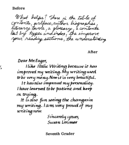
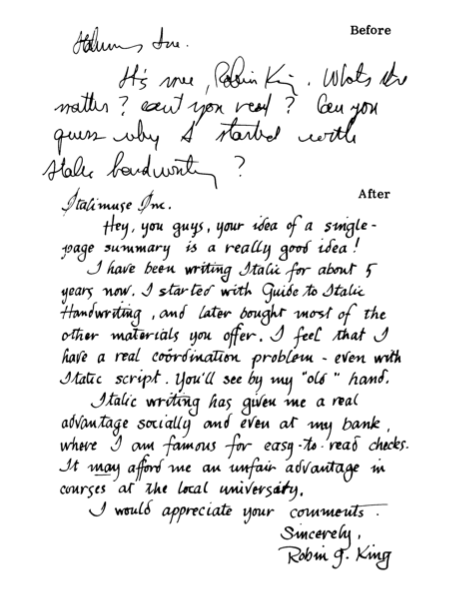
This from Alfred Fairbanks’ book
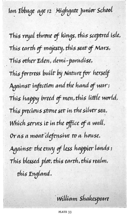
These 3 older videos I have found helpful as well.
I’m hopeful that you can use this information to help the little ones write more easily, and also help you improve your own handwriting.